Simon & Siouxsie Branding
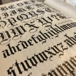
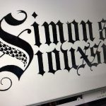
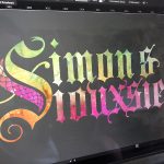
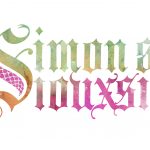
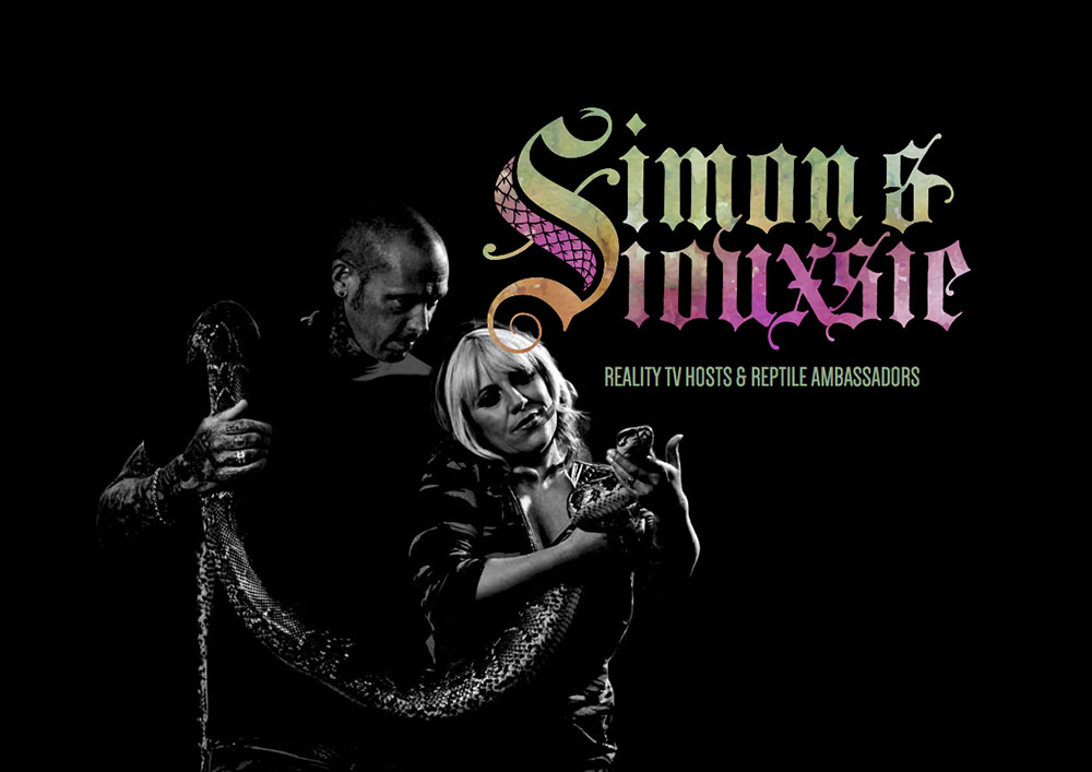
We dusted off the old Blackletter calligraphy to have a heap of fun designing the logo for two awesome reptile-friendly humans.
A single logo but with two distinct people working together as a team.
We dusted off the old Blackletter calligraphy to have a heap of fun designing the logo for two awesome reptile-friendly humans 
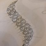
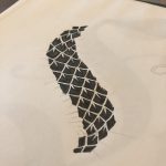
Hosts of the successful NatGeo WILD series, Snake City, Simon and Siouxsie needed a brand identity that represented who they are and their passion – reptiles and tattoos. Blackletter has a certain edge to it, and with the combination of snake scales and a custom “S”, they gelled nicely.
In our view, all logos have to work in black and white. With that as the solid groundwork, we then added watercolor for the full colour treatment – and the colours needed to represent the individual and their own personalities. A single logo but two distinct people working together as a team.
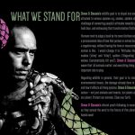
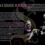
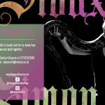
We were then asked to create an email “handout” for interested venues to host the duo and for their roadshows around the UK, USA and South Africa – or wherever they are needed. This was an excellent opportunity to develop their brand further.
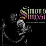
We took their colourful publicity stills and cranked up the contrast and used a simple black and white treatment to juxtapose alongside their brand identity and the colours in the rest of the design pages.

